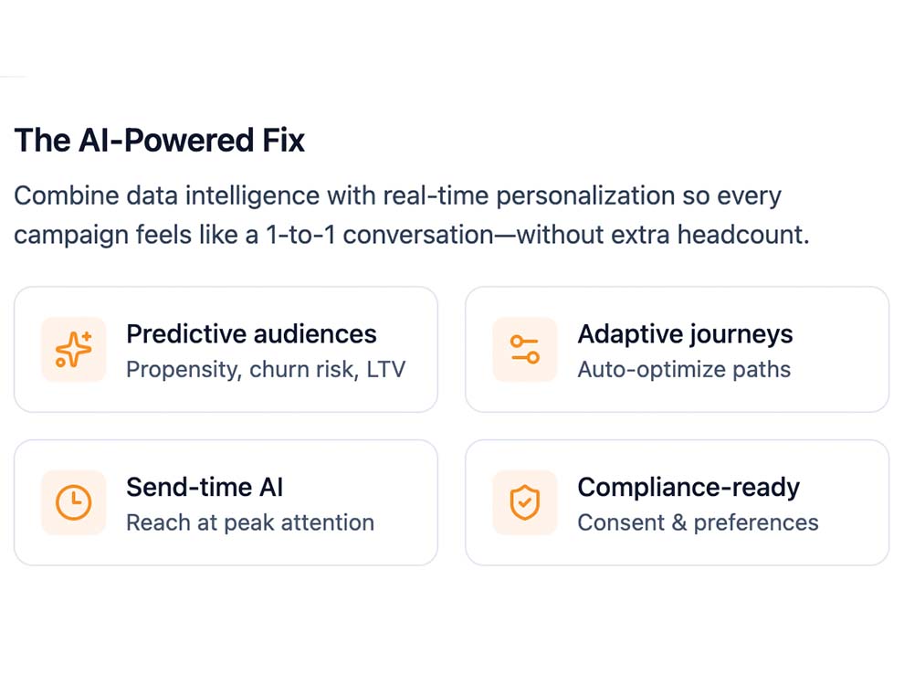
Discover how AI-powered marketing automation transforms your results. Stop blending in with batch-and-blast marketing—every generic message, loyalty offer, or promotion costs you engagement and revenue. Mobilozophy’s AI-powered platform turns your data into intelligent marketing that delivers memorable 1:1 experiences, even at scale.


Without AI, marketing becomes guesswork—resulting in untargeted engagement, irrelevant offers, and missed high-intent moments. The impact? Lower click-through rates, declining membership activity, fewer redemptions, rising unsubscribes, and lost revenue.


Collect zero- and first-party data that feeds directly into a Customer Data Platform (CDP), where it’s securely stored and unified to give you a complete, real-time view of each customer, uncovering invaluable insights into customer preferences, behaviors, and engagement history—empowering you to craft highly targeted, personalized marketing strategies that drive deeper connections and better results.
Learn moreArtificial Intelligence or AI isn’t just a buzzword—it’s your secret weapon for creating seamless, personalized customer experiences. By analyzing behaviors, purchases, and other key data, AI helps you build smart workflows that keep your audience engaged and coming back for more. Effortless automation, real-time insights, and spot-on personalization? That’s the power of AI working for you!
Learn more


Guide your audience through a memorable journey with AI-driven, data-powered messaging. Deliver personalized content across multiple channels—SMS, email, push notifications, and more—ensuring you reach them at the right moment, every time.
Learn moreWhy settle for average promotions when you can deliver coupons that truly connect? Our marketing automation software helps you send the right deal, to the right person, at the perfect time—on the channels they actually use. More engagement, more conversions, and more happy customers. Now that’s smart marketing!
Learn more


Delight your customers with loyalty programs that keep them coming back for more. Reward actions, purchases, and brand interactions with rewards that create unforgettable experiences—and long-term relationships.
Learn moreTake the guesswork out of your marketing efforts with deep, data-driven analytics. Track customer engagement, redemption trends, and campaign performance in real time—so you can fine-tune your strategy, boost ROI, and keep customers coming back for more. Smart insights lead to smarter decisions!
Learn more


Why reinvent the wheel when you can supercharge your existing apps with our pre-built APIs and SDKs? Easily add powerful marketing automation features without the headache of building from scratch. And don’t worry—you’re not in this alone. Our expert team is here to help with seamless integration and ongoing support, so you get the best results with zero stress.
Learn more
Brands leverage Mobilozophy's marketing automation software for personalized campaigns, from redeemable coupons to WiFi marketing, optimizing customer journeys and driving long-term growth.


