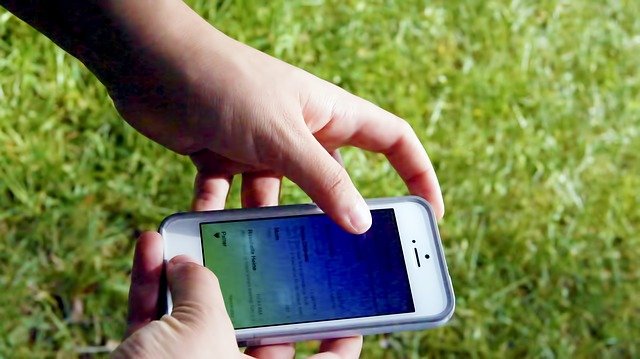


Emails look great on desktops and laptops. However, many people use their mobile devices to view emails. Many emails on tablets, smartphones, netbooks, and other internet devices look terrible. The endless scrolling, the eye-straining words, and the omitted photos make email viewing cringe-worthy. In this post, we’ll give you a few tips for mobile-friendly email design. Your readers will thank you.
Responsive web design
Like websites, responsive web design in email works great on mobile devices with minimal effort. The web page adjusts to screen size automatically. Use pre-determined or custom templates that are responsive web design-friendly. If you don't have responsive web design, create an equally effective mobile-friendly website.
Break up paragraphs
Long paragraphs don't work on mobile devices. The endless scrolling to read one paragraph is brutal compared to reading it on laptops. Give mobile readers the scoop by placing juicy headlines and sentences at the top.
Trim the fat on images
Images may be great on a laptop or desktop, but images on mobile devices they can cause heavy load times. Only use the images that are essential to your email. To limit distractions and heavy load times, be sure your images are optimized to keep emails clean and simple. Always preview your email and make sure it still looks great, even if none of the images are displayed.
Addtionally, Set the width of the image to the proportion of the screen you want it to take up. Then, set the height to "auto" so that it will automatically adjust based on the width.
Back to basics in email headers
The subject line, the 'from' line, and pre-header text are too small for details. Only a few letters, numbers, spaces, and symbols are visible on mobile devices, so get to the point and keep it simple. Mailchimp recommends keeping your subject line to 50 characters or fewer (that includes spaces).
Mobile-friendly links
Rerouting users to another page via a link forces the assumption that the page is mobile-friendly too. Ensure that the links you're referencing point to mobile-friendly pages as well.
Buttons
Click a button with a finger instead of dragging the mouse to the desired location. Mobile users love a touchscreen mobile device because of the convenience. Make buttons large so that fat fingers can touch and click successfully. The average size of an adult index finger is 45-57 pixels on a mobile device.
Go Mobile
The tweaks necessary to make email mobile-friendly don’t require a lot of rework. The problem is many businesses simply don’t think about mobile, and don't make the changes.
What are you waiting for? Capture a mobile audience with mobile-friendly email. Just don't forget to test out the results before showing it to the world.